
Written by Paul Litely at Paullitely.com
PREAMBLE:
We are being told daily that carbon dioxide, and in particular, carbon dioxide that is man-made, controls the Earths climate in a direct fashion. However, all of the predictions of rapid dramatic warming in proportion to rising carbon dioxide have not been fulfilled. What we are seeing instead is increasing doses of deepened global cooling in winter, and shortened summers. Simply watch yourself for the mechanism of increasing cloudiness, rain, and snow. It validates the predictions of global cooling being made by more and more climate experts.
This global cooling will be obvious to all by the year 2021, despite continuing increases in atmospheric carbon dioxide . In fact it is the cycles of the ocean currents, the motion of the planets and their effect on the sun, as well as the position of our solar system in our galaxy, the Milky Way, that are the largest, most consistent determinants of earths climate.
Carbon dioxide does not lead global warming, but instead follows it by hundreds of years, and is such a tiny effect on Earth’s climate as to be insignificant. The repetitive short cycles that describe the earths climate change over hundreds of years have been modeled successfully by Theodore Landscheidt, Carl Smith, And Geoff Sharp. They describe the cycles in relation to the motion of the planets in our Solar system. However, the mechanism was described by other researchers and theorists. Cosmic rays make clouds on Earth, and the Sun protects us from cosmic rays when it is active as shown by sunspots.
The longer cycles of warm periods and long deep Ice ages That correspond to the approximate 25,000 year Mayan calendar can be accounted for by the same indirect solar mechanism that works over hundreds of years. The great Iceages are Caused by the gross exposure we have to cosmic rays from the black hole at the center of our Milky Way Galaxy.. The limited capacity of our Sun to protect us from cloud-forming cosmic rays is overwhelmed as the solar system oscilates out of and through the protective plane of our Milky Way galaxy. Approximately 25,000 years in protection, and 75,000 years out in the open. The Mayans knew the cycles.
The crime of the millennium is that we are being told to prepare for uncomfortable heat, when we are in fact entering a period of deadly cold for at least 50 years, possibly longer, then warming for a while before rolling into another 75,000 year Ice Age at the end of this 25,000 year warm period. The warm period ended with the most recent Mayan calendar..
This essay titled “How in the Universe…” is my original compilation of 10 years of study on earths climate change theories and factual data, with some intuition on how to link it all together in a coherent and consistent “Global” model. This model works going back in Time. Global Warming theory quickly breaks down when applied to the record of Earth’s past Clomate changes. How can it be useful for predicting the future, if it cannot predict the past? It just can’t, and all of its predictions have failed to appear.
The details of my analysis and accumulation of facts are what follows. No matter, if you understand the details or not, what you can expect is more clouds, rain, and snow. It will soon be obvious to all, as these definite motions of our planets and our complete solar system go on repeating themselves, as they have for many millions of years. Watch for it with your own senses. Take note of it. All the while we will be getting dramatically colder as carbon dioxide continues to rise, with no effect, regardless of human contributions.
The worthy “Global warming” campaign objective is to reduce the accumulation of wealth and pollution from fossil fuels. It is being realized to a degree. However the lost opportunity to prepare for deadly cold, and the resulting loss of easy food cultivation, may not be worth it, Hundreds of thousands, perhaps millions of humans will die because our leaders cling to a failed, but politically convenient, and financially profitable theory about Earths climate… “Global Warming” From Carbon Dioxide.
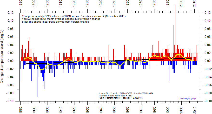
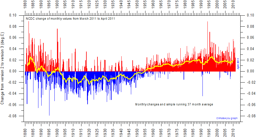
NASA has recently altered its previously published temperature records over the last 100 years to cool the past and warm the present on paper. The evidence is clear and undeniable. NASA did it more than once to hide the reality of global cooling, as happened from 1949 to 1984. There are billions of dollars from annual international fundraisers and individual government programs at stake. Those who benefit will not loosen their grip easily. Will they tell us that Carbon Dioxide is now cooling us to keep it going? Yes, it is even likely.
Meanwhile, a Deadly Cold future goes unprepared for. Watch, but don’t wait to do your own personal preparations. Stockpile food. Stay near the ocean and it’s warming influence, and it’s abundant seafood. Call out our leaders as they deny the reality of cooling vs the predicted warming as Carbon Dioxide continues to rise in the atmosphere.
ARTICLE:
How in the universe do we connect weather or climate event to Human Caused CO2? Atmospheric Carbon Dioxide has been increasing for the last 7,000 years, while the Earth’s Average Temperature has been Decreasing for the last 3,000 years, according to Ice Cores.
Humans contribute less than 10% of the recent 10% rise in CO2. CO2 is only 1% of the Greenhouse gas concentration in the atmosphere. Water Vapor is 97% of the greenhouse gas in Earth’s Atmosphere and that makes Clouds, rain, and snow with no help from CO2. Vast amounts of heat is absorbed and released as water evaporates, rises, and condenses and freezes. This change in what Water looks like is called “Changing Phases”. It is still H2O as liquid water, a water vapor gas, or solid ice.
Carbon Dioxide (CO2) does not change phases to solid or liquid at Earthly Temperatures and Pressures. It freezes at minus 109 degrees Fahrenheit. It does not become a liquid, but goes directly from ice to a gas. You have seen it as “Dry Ice”. CO2 cannot store an release such vast amounts of heat energy as water does. It therefore cannot dominate as a greenhouse gas when 97% of earth’s greenhouse gas is water vapor. Global Warming Models do not attempt to model Water as liquid or vapor, or ice because it is “too complicated”, and the theorists admit it. It is also too powerful, so it dominates the movement of heat, and upsets Global Warming Theory models.. So, lets just look at water as a vapor, as a greenhouse gas like CO2, and compare the two. How do they act when the sun shines on them?
- Note the area on the graph below labeled “Infrared” this is the Sun’s. radiation that HEATS surfaces that don’t reflect it. Note that CO2 is only connected to a narrow part of the Infrared (heating) spectrum, while Water Vapor connects across most of it. The red part of the graph is the bandwidth of the Sun’s Solar Irradiance (Brightness). The blue part of the graph is the bandwidth of stored invisible heat radiation that goes back upward from the Earth’s surface. That heat originally came from daytime sunshine. The grey parts of the graph are where the various greenhouse gasses absorb and then re-radiate energy. Note the “Hole” in the Water Vapor Grey area just under the Blue. This is the only big part of stored surface heat that is NOT absorbed by water vapor or consumed by evaporation of water to make water vapor. Note that CO2 does nothing to stop that blue heat energy that escapes upward from the Surface of the Earth except for the right 1/4 of that blue peak. This clearly shows that ONLY water vapor is an important greenhouse gas. CO2 is just a tiny one-hump player, and can Never dominate or control the heating of water vapor. This should be enough proof that CO2 is powerless, but there is much much more.

CO2 is such a weak Greenhouse gas that it is insignificant regardless of the amount of Solar Radiation spectrum it interacts with. Water Vapor rules on its own as a greenhouse gas.
Water vapor is vastly more important in moving heat for another reason. Water Vapor changes state to water or ice, and back from water or ice, with huge Quantum (instant) heat absorption and release. Water vapor also condenses into liquid water when it saturates the air at a given temperature. On the other hand, CO2 precipitates directly to a solid, or sublimates directly to a gas, without passing through a liquid state, and does this at MINUS 109 degrees Farenheit under normal atmospheric temperature and pressure ranges. CO2 NEVER changes state to ice near the Earth’s surface because the Earth’s surface or atmosphere Never gets down to Minus 109 Degrees. CO2 therefore cannot move heat energy in the most important way possible.
Water Vapor at lower altitude temperature and pressure changes state into liquid water, making clouds. Clouds are a very high efficiency reflector for Solar infrared (Heating) radiant energy, shading water and land with 90% efficiency. However clouds do let non-heating ultraviolet radiation through, giving you a sunburn on a Cloudy day. Water vapor rises because it is lighter than air. When it rises up into the cold upper air, water vapor condenses into clouds, rain, and snow. When this happens, Clouds radiate huge amounts of heat into space from the condensation of water vapor to water, rain, and ice. Global Surface Temperatures decline with increased Cloudiness because of reflecting shade and the transport of heat by evaporation from the surface to form clouds that radiate heat energy into space.
This plot and graph of observed temperatures vs cloudy days around the world clearly shows that more clouds are associated with colder temperatures.

Here is the recent relationship between Cloud Cover (Green) and Earth’s Surface Temperature (Blue). It makes sense, doesn’t it? More clouds = cooling. We have all felt the effects.

Huge amounts of Solar radiant energy are needed every day to keep this negative feedback from going to cold. Compare the graph of recent Global Cloudiness below with the next graph of recent Global Temperature. Flip it over, and see if it fits the temperature graph better than the graph of CO2. There is No contest as the CO2 line does not follow measured temperatures. Meanwhile, temperatures clearly move directly opposite the cloudiness.

Does the Graph of Cloud Cover explain Global Temperature better than CO2?

Global Temperatures move opposite to Global Cloud Cover. Clouds are condensation from Water Vapor. Clouds release heat into space when they form. Water vapor gets this heat by evaporation, cooling the Earth’s surface. Clouds are 90% efficient at reflecting the sun’s heating radiation into space. CO2 is an orphan. CO2 has no significant role. Water Vapor is not controlled by CO2. Global Water Vapor has stayed almost constant recently, except it has declined at higher altitudes. (See Top line in the graph below) Higher altitudes are where CO2 Global Warming theory said Water Vapor would increase to do more Greenhouse warming because heat from CO2 put it there. That is the most basic Global Warming assumption. It is clearly not happening. Neither is the predicted warming.

It is apparent that the increased Cloud Cover does not dent the amount of Water Vapor in the atmosphere at lower altitudes (Bottom two lines). This makes sense, because the air has to be saturated with 100% humidity for clouds to form. The excess falls out as rain or snow. Humidity cannot get higher than 100%. Any added moisture in the air just drops out as clouds, rain, or snow. Clouds occur almost exclusively at lower altitudes, when the air cools and cannot hold any more water vapor. The excess becomes clouds and rain and ice. In the chart above, the amount of water vapor at lower altitudes (bottom two lines) is almost constant, increasing slowly. The Greenhouse effect of Water Vapor is therefore fairly constant now, on average. The only variable here is the amount of water vapor rising, making clouds, and falling down.
Global Surface temperatures are controlled by the extent of Cloud Cover, since the Sun’s “Irradiance” is very constant, and only varies by less than 1/4%. Clouds form when the sun heats the Earth’s surfaces, including oceans, and the water vapor generated rises to cooler altitudes to make clouds. When Cloud Cover is widespread, the Sun’s Energy is reflected back into space with up to 90% efficiency. When Cloud Cover is sparce, the land and seas can absorb the Sun’s Energy and the Earth warms. Clouds act as “Venetian Blinds” to block or allow the Sun’s Energy through to heat the land and seas. Here is a graph showing that relationship between Solar Energy being sent back into space (Red Line) and the Earth’s Global Temperature (Blue Line). They are opposites. It seems the prime driver of Global Temperatures is clearly Cloud Cover.

When Cloudiness increases, Earth’s temperature decreases. When cloudiness decreases, Earth’s temperature increases. They move oppositely.
There is now strong evidence that the Sun controls Cloud Cover indirectly by controlling the amount of Cosmic Rays that reach the Earth to make clouds.
http://www.thehindu.com/todays-paper/tp-national/article1107174.ece
Here is a graph of that very striking inverse (opposite) relationship of Solar Activity as measured by sunspots (Blue), and historic cosmic rays. (Red).

It has been shown experimentally in Cloud Chambers, that high energy protons and neutrons that ARE Cosmic Rays, will make cloud formation easier. The term for this is Nucleation. Periods of high sunspot. Activity make strong solar winds and magnetic fields that blow away Cosmic rays headed for Earth. So, It appears that the Sunspot cycles contribute strongly to the Earth’s global temperature cycles by this indirect method. More sunspots, less Cosmic Rays and less clouds to block the Sun from warming the Earth’s surfaces. Less Sunspots, and more Cosmic Rays get through to make clouds form easier, making shade and reflecting the Sun’s energy back into space, cooling the Earth’s surfaces. So THAT is how the Sun indirectly, but strongly, controls the Earth’s Global Temperature, not by changing the strength of sunlight. The Global warming models have NO accounting for this indirect control of clouds by the Sun, but simply say the intensity of sunshine (irradiance) is almost constant.
Here is how the sun’s control of clouds works according to one of the discoverers, Professor Henrik Svensmark.
There is other strong evidence that the Sun’s Activity, as evidenced by Sunspots, controls the Earth’s Global Temperature. During two periods in the last 400 years the sun’s activity went down for several 11-year cycles in a row, resulting in periods of deadly cold for the Earth and Humans. The “Maunder Minimum” lasted for about 60 years with almost no sunspots, a time known as the “Little Ice Age”. Another dip in the Sun’s activity occurred about 200 years ago, known as the “Dalton Minimum”. Although not as long or deep, it, too resulted in thousands of people dying of freezing cold or starvation from not being able to grow crops because of very long winters. One year of low solar activity had no summer at all. American Indians recall a year of snow on the ground in Florida.
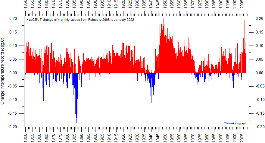
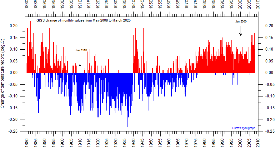
It works in reverse, too. In recent times, we have had high numbers of Sunspots, and that has resulted in the “Modern Maximum”, where winters are reasonably short and summers long enough to grow food, with some uncomfortably warm periods in the 1890’s and 1930’s, much warmer than today. Note: The hot 1930’s are being denied and covered up by official record keepers (see my blog with detailed graphs). Worldwide Temperature records have been manipulated to lower the temperatures shown in the first half of the 1900s and to raise the temperatures shown since then up to today to make recent times to appear warmer. See detailed graphs in the Paullitely.com Blog entry beginning with HadCRUT.
Here below is a graph of the Solar Activity sunspot cycles going back 400 years. See the notations for the deadly little ice ages and the recent Modern Maximum warm period where we have thrived.

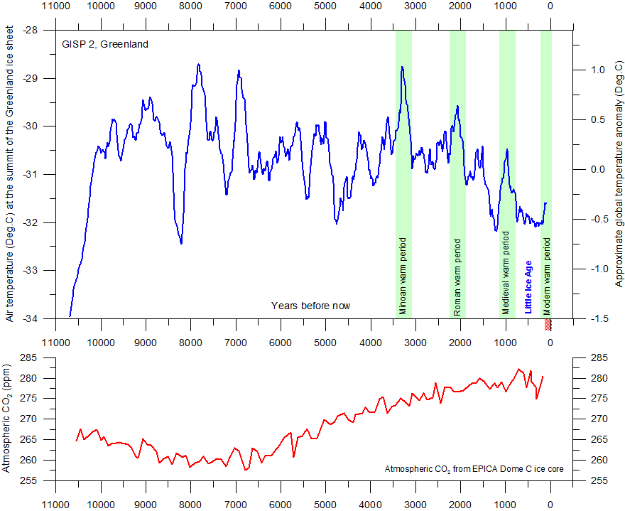
Although we do not have sunspot records back that far, it is important to see that ice cores show the Earth’s surface temperatures were much much warmer than today for years about 1100 to 1300 AD. This was the time of enlightenment and Renaissance, when food was plenty and cold weather did not kill in Europe. see chart below. Of course, humans did not contribute much CO2 back then, so human made CO2 could not have caused it.

See the colored chart below of recent Sunspot measurements. The Last two Sunspot cycles through today are numbered #23 and #24. They have peaks that are lower than the peak before by 30% each time. The current Sunspot peak #24 is delayed, and has a “Double Hump”. This same formation happened at the beginning of the long cold Maunder Minimum with almost no sunspots that lasted for 60 years of very cold temperatures on Earth. There is a strong possibility we are headed there again right now, to a new mini-iceage, as predicted in 1989 by Theodor Landscheidt. If so, we are not looking at a “Globalwarming” future, but instead, an extended “Globalcooling” period that will be deadly, as it was each of the last times the sun got stuck at low sunspot activity.
Look closely at at this graph of the declining Sunspot cycles we are in. This pattern was seen going into the Maunder Minimum, and the next major peak took 60 years to appear, and we froze. We don’t know that will happen, but it is likely the next peak could be lower than this one we are in – Cycle 24.

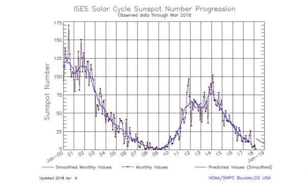
We are now at the right hand edge of the roller coaster ride, headed for the bottom again. We don’t know if there is a Cycle #25 hump coming, or how big it may be. What we do know is that these low solar activity cycles come around about every 200 years as the Sun’s magnetic poles get “Stuck” in neutral or lock on to each other when trying to switch places. This is happening now, right on time, according to Theodor Landscheidt, and the Sun has not finished flipping poles as of 2016. In 5 years, it could get stuck trying to flip. It surely looks to many, many of us like deadly cold weather is ahead for some time, as in the past mini ice ages. Evidence of Global Cooling is all around us.
Before you dismiss the following facts, read the other posts on this site regarding how ALL claims of Global Warming are based on Temperature Records that have been changed to MAKE warming while the raw measurements show cooling. Polar ice is nearly back to normal in 2016. Antarctic ice is the highest in 35 years. Greenland did not seen a summer in 2015 and has added ice over 85% of its surface. Sidney Australia had its first snow since 1835 in this year, 2015.
The last few years have brought more and more polar ice, Colder and longer Winters, and Record low temperatures, even in the Summer. The Modern Little Ice Age may last for 20 years or it may go on for 60 years as it did in the 1600’s. Each new Solar Cycle from high to low takes 11 years from the last one. We will see continued cooling at least that long from now. The cold caused by lower and lower peaks at Sunspot Cycle #23 and #24 are still unfolding. it can take 11 years for the Earth to change temperature direction and follow the sun This current period of low Solar Activity is called the Landscheidt Grand Minimum, for Theodor Landscheidt, who predicted it back in 1989. He accurately predicted global weather from the Sun’s declining activity and ocean currents. Here is an article on that by Landscheidt himself:
http://www.schulphysik.de/klima/landscheidt/iceage.htm
The long ice ages can also be explained. What is worrying some scientists, and me, is what if the amount of Cosmic Rays heading for Earth increase so they are very very intense – too much for the Sun to block? The Sun’s solar winds and magnetic fields can only divert just so much of the incoming cosmic rays. Very intense cosmic ray exposure may overcome the Sun’s protection completely. It appears that this is what happens to make the deep 100,000 Year ice ages that have occurred on Earth. Here is a graph of the history going back 420,000 Years. Note the long deep ice ages, and the short warm peaks. We are right now just a speck on the right side of the red box on a warm peak now, ready to fall back down into a deep ice age, as before.
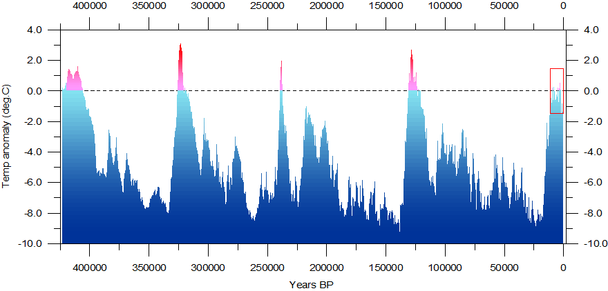
Here is a magnification of that red box, showing that we are at the end of it. Temperatures have been declining for the last 3000 years. If we fall off that cliff, the little ice ages we are discussing here will be insignificant. Sheer survival of species, including humans, will be at great risk. The cost of simply keeping warm and finding/making food will be staggering, and societies will be shredded. The 125,000 year Mayan Calendar has just reset.

An explanation for the great ice ages seems to be as follows, based on astronomy observations. The solar system “Bobs” up and down through the plane of our Galaxy, the “Milky Way”. Right now, we are in the plane of the disc. Because we cannot see very far through the thick middle layer, we are protected from most of the Cosmic rays coming from the other stars in the Milky Way and the supermassive black hole at its center. Our exposure is blocked by nearby stars and gas clouds. This protection only lasts for about 13,000 years, Then the Solar System moves out to clear space where cosmic rays from most of the Milky Way Galaxy and beyond can reach us unobstructed.
We seem to be moving out of safety and into the dense stream of cosmic rays that are so strong that our Sun cannot block them. As that happens, the Earth will rapidly cloud over and cool, making the next Ice Age. Ice Ages last about 100,000 years. This effect compounds the Sun’s current inactivity. The little ice age we may be entering may just tip over right into the next grand ice age for 100,000 years. As a result, we may see a very, very rapid descent into dense cloud cover and even more intense, deadly cold. The Landsheidt Minimum little ice age we are in now will most likely reach the coldest by 2025, and it could stay there for decades as it did in the Maunder Minimum. OR, the sun may come unstuck from it’s state of no magnetic poles and help us warm up first. Either way, we are already on the way down the roller coaster ramp for a period of significant cooling.
There is a delay of the effect of the sun’s cycles and the Earth’s cooling of approximately one solar cycle. Heating took time. Cooling takes time. Two lower and lower solar cycles have just occurred. We have not seen the full effects of the past two lower solar cycles. We will not see the full effects for another 11 to 20 years. Even a strong recovery of the Sun, after it finishes flipping North and South magnetic poles, may shield us for a while longer, but it seems it will eventually be overpowered by intense cosmic rays.
Here is an artists representation of the “Bobbing” of the Earth and Solar System through the plane of the Milky Way. It takes approximately 25,000 years to pass through the central disk of the Milky Way, then about 100,000 years to return. The 25,000 years corresponds to the length of the Mayan Calendar, that coincidentally just ended, along with the current warm period on Earth. During that passage, the Disk of the Milky Way itself shields us from the most intense cosmic rays, and the Sun can deflect them when the Sun is Active with Sunspots. During the next approximate 100,000 years, the solar system is outside the central disk of the Milky Way, and is exposed to intense Cosmic Rays from the Ultra-Massive Black Hole at the center of the Milky Way, as well as the entire plane of other active radiant objects. During this time, the Sun is not powerful enough to deflect this intense bombardment of Earth, and Earth clouds over into a Major Ice Age until the Solar System returns to the protection of the central Disk of the Milky Way.

There is a video on YouTube that goes with this image. It is accompanied by dire warnings of the social consequences, and correlations with the Mayan Calendar.
Tipping into the next Major Ice Age will not be abrupt because it takes thousands of years. However, tipping into the Landscheidt Mini Ice Age, as we are today, will be very abrupt if the Maunder Minimum is being repeated as Landscheidt, and Carl Smith and Geoff Sharp predicted. The Maunder Minimum descended in a matter of a few decades with a pattern of declining Sunspot activity that is being ecoed today.
It is deadly cold we should be preparing for, not a future of Global Warming and uncomfortable warmth. The evidence will be mounting undeniably in the next few years. The “Maunder Minimum” from 1645 to 1715 was accompanied by wars, starvation, plagues and persecution by extremists who believed our God had been offended, so he made it deadly cold. European Rivers froze over annually, including the Thames in England. Snow stuck to the ground for most of the year. The sun was obscured by clouds for long periods. It is known as “The Dark Ages” because it was dark. We may be WISHING FOR WARMING as happened in the years 1100 to 1300, whose benefit was the ability to grow food further towards the Earth’s Poles. The Earth was as much as two degrees warmer than now. There were Vineyards in England. The street signs remain today celebrating them. Food was abundant, and disease was less prevalent. Wars were infrequent. Live was easier. It is known as the “Medieval Warm Period”, and “The Age of Enlightenment”. Warmth is good. Cold is deadly.
In the meantime, the Atmosphere is getting richer in CO2, and that is plant food. Canadians direct the exhaust from their propane heaters into their greenhouses to increase the CO2 and double plant growth during their short Summers. Ironically, today’s rising CO2 levels have increased forest growth on Earth. More CO2 can make it easier to grow food during the upcoming deadly cold with very short summers. CO2 is not a poison, or we would not put it into our soft drinks and carbonated water and greenhouses.
Official Global Warming model temperatures closely follow the amount of Carbon Dioxide in the atmosphere. It is a straight line for most of the last 1500 years. How does it line up with Earths actual temperatures over the last 1500 years?
Click to enlarge the graph. Blue Is the IPCC model that uses CO2 to graph temperature changes. Since CO2 rose steadily and evenly, of course the model will produce the same steady graph since it assumes CO2 controls Global Temperature. The Red line is the actual temperature changes from ice core sample measurements and recent Satellite measurements. The IPCC Models have ironed out natural temperature changes in favor of showing a nearly straight history with a recent upturn. Why? What do you believe? This is the infamous “Hockey Stick” Global Temperature curve in Blue. in Red, is the actual temperature curve from Ice Core Research, NOT from models. THE IPCC MODELS CANNOT PREDICT THE PAST… SO HOW CAN THEY PREDICT THE FUTURE?

High levels of CO2 have to be very high to be dangerous to humans. Submarines and the International. Space station keep CO2 levels as high as 4,000 parts par million, or 10 times our 400 ppm atmospheric CO2 today. Our breath can be 10 times higher, at 40,000 ppm when we exhale. CO2 is not the Devil. It is a green plant’s best friend along with water and sunlight.
The grand experiment of looking for proof of Global Warming predictions in nature has failed so miserably that the promoters of the story have to alter raw historic records and MAKE warming to keep fundraising and salaries and grants totaling about $1Billion per day worldwide. Aside from encouraging solar and wind power at great expense with government subsidies, We get NOTHING for it. We get inconveniences and more expensive basics.. Food, energy, and shelter, so the poorest suffer the most. Promoters of Global Warming theory refuse to continue to refer to their position as what it is: CO2 Globalwarming. That is their basic claim. They now insist that we are seeing “Climate Change”, with the assumption that humans are causing it. They have abandoned the Warming label, because it is not happening except by their adjustments to raw temperature data, as seen in the next chart below. Supporters of the Global Warming models (NOAA, USHCN) have even adjusted historic PUBLISHED temperature data down in the past and up in recent times to track with the increase in atmospheric Carbon Dioxide.

Soon, we will have to Avoid using the term ClimateChange, because we now need that term for the inescapable little ice age we have entered. We really could use some Globalwarming after all, but I would not not count on it, from what I can see.
Environmentalism is a wonderful thing, and I am an avid environmentalist. That is why I have studied this Global Warming subject for Ten years. Wasteful fundraising to make or stop the weather is not a good thing. It is literally impossible for humans to change the weather, but $1billion per day pays those who say they can. Imagine what we could do to make life better for our fellow humans, animals, plants and our lovely planet with that money. Instead, it is being wasted where it makes no positive difference. Watch for the next United Nations IPCC fundraiser and their outrageous forecasts that have not come true. There has been no global warming for 20 years, and humans did not stop it. It just did not happen as they predicted. Instead of excuses, we need a revised model, or what are they being paid for? Meanwhile, we should at least be using some or most of that money to prepare for what is really coming, and has started… deadly cold. The survival of millions of people will depend upon it. Reality is pressing ahead.


